


The world has made immense progress against extreme poverty, but it is still the reality for almost one in ten people worldwide.
Two centuries ago, the majority of the world population was extremely poor. Back then, it was widely believed that widespread poverty was inevitable. But this turned out to be wrong. Economic growth is possible, and poverty can decline. The world has made immense progress against extreme poverty.
But even after two centuries of progress, extreme poverty is still the reality for every tenth person in the world. This is what the ‘international poverty line’ highlights – this metric plays an important (and successful) role in focusing the world’s attention on the very poorest people in the world.
The poorest people today live in countries that have achieved no economic growth. This stagnation of the world’s poorest economies is one of the largest problems of our time. Unless this changes, hundreds of millions of people will continue to live in extreme poverty.
The state of poverty today
There are poor people in every country, people who live in poor housing and who struggle to afford basic goods and services like heating, transport, and healthy food for themselves and their families.
The definition of poverty differs from country to country, but in high-income countries, the poverty line is around $30 per day.1
Even in the world’s richest countries, a substantial share of people – between every 10th and every 5th person – lives below this poverty line.
In the map below, and in all international poverty statistics on Our World in Data, the data is adjusted for inflation and cross-country differences in the price level. The expandable section below the map provides a more detailed explanation of how.
Basics of global poverty measurement
Throughout this article – and in global income and expenditure data generally – the statisticians who produce these figures are careful to make these numbers as comparable as possible.
Non-monetary sources of income are taken into account
Many poor people today and in the past rely on subsistence farming and do not have a monetary income. To take this into account and make a fair comparison of their living standards, the statisticians that produce these figures estimate the monetary value of their home production and add it to their income/expenditure.
Differences in purchasing power and inflation are taken into account
The data is expressed in international dollars. This is a hypothetical currency that results from price adjustments across time and place.2 An international dollar is defined as having the same purchasing power as one US-$ in the US. This means no matter where in the world a person is living on int.-$30, they can buy the goods and services that cost $30 in the US. None of these adjustments are ever going to be perfect, but in a world where price differences are large, it is important to attempt to account for these differences as well as possible, and this is what these adjustments do.3
Throughout this text, I’m always adjusting incomes for price changes over time and price differences between countries in this way. All dollar values discussed here are presented in int.-$; the UN does the same for the $2.15 poverty line. Sometimes I leave out ‘international’ as it is awkward to repeat it all the time; but every time I mention any $ amount in this text, I’m referring to international-$ and not US-$.4
Global data is a mix of income and expenditure data
There is no global survey of incomes: researchers need to rely on the available national surveys. Such surveys are designed with cross-country comparability in mind, but because they reflect the circumstances and priorities of individual countries, there are some important differences across countries. In most high-income countries, the surveys capture people’s incomes, while in poorer countries, these surveys tend to capture people’s consumption.
The two concepts are closely related: the income of a household equals their consumption plus any saving (or minus any borrowing). When speaking about these statistics, it would therefore be accurate to speak about ‘the income of people in richer countries and the monetary value of consumption in poorer countries’. But since it’d be a bit much to repeat this every time, researchers simply speak of ‘living standards’ or ‘income’ instead. I do the same in this text.
We can apply this $30-a-day-poverty-line to the global income distribution to see the share in poverty as judged by the definition of poverty in high-income countries.5
The latest global data tells us that the huge majority – 84% of the world population – live on less than $30 per day. That means 6.7 billion people.

Why is an extremely low poverty line necessary?
Extreme poverty is defined by the UN as living on less than $2.15 a day. Why do we need a poverty line that is so extremely low?
It is not enough to measure global poverty solely by a higher poverty line because a large number of people are living in extreme poverty. Without an extremely low poverty line, we would not be able to see that a large share of the world lives in such deep poverty.
If we’d only rely on the poverty line from high-income countries, we would hide the differences between people with very different living standards. Whether someone was living on almost $30 a day or on thirty times less would not matter – they would all be considered ‘poor’.
It is however a good idea to add additional poverty lines. As the following chart shows, this can draw attention to the large income differences between people and highlights how many live on extremely low incomes.6
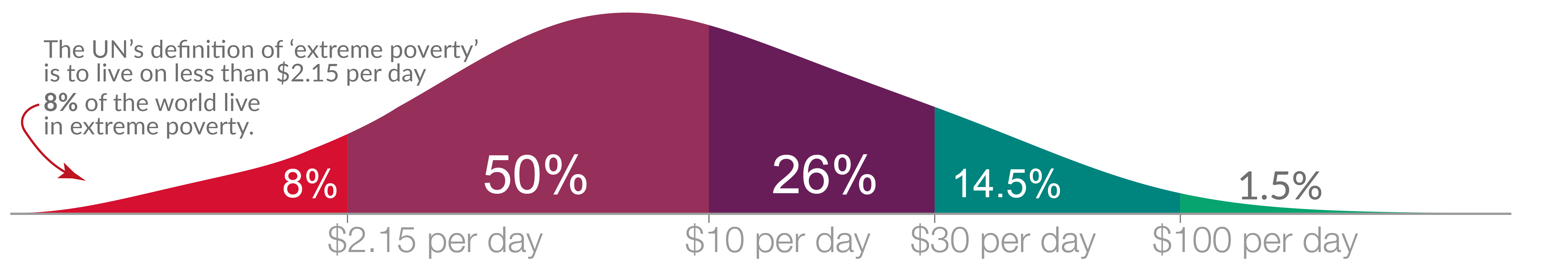
The $2.15 poverty line, set by the UN, shows that globally close to one in ten people live in extreme poverty. In all these statistics, the researchers are not only taking people’s monetary income into account, but also their non-monetary income and home production. One reason why this is important is because many poor people are small-scale farmers who produce their own food.7
The UN’s global poverty line is valuable because it has been successful in drawing attention to the terrible depths of extreme poverty of the poorest people in the world.8
In a related essay, I focus on global poverty as defined by a higher poverty line.
What needs explanation is not poverty, but prosperity. Deep poverty was the condition that the majority of humanity has always lived in. In the pre-modern days, hunger was widespread, and every second child died no matter where in the world it was born.
Historian Michail Moatsos has recently produced a new global dataset that goes back two centuries. The chart shows his data. According to his research three-quarters of the world lived in extreme poverty in 1820. This means they “could not afford a tiny space to live, some minimum heating capacity, and food that would not induce malnutrition.”9
The chart looks simple, but it would be a mistake to think that it was simple to produce this data. Underlying it is a wealth of careful historical research that Moatsos made use of. Historians gathered data for people around the world over two centuries to reconstruct how many of them were able to afford a set of very basic goods and services and aggregated this detailed information into this final picture. You find more information on the methodology in the footnote.10
Economic growth made it possible to leave poverty behind
Economic growth made it possible to leave the widespread extreme poverty of the past behind. It made the difference between a society in which the majority were lacking even the most basic goods and services – food, decent housing and clothes, healthcare, public infrastructure and transport – and a society in which these products are widely available.
Growth means that a society produces an increasing quantity and quality of economic goods and services. The key to economic growth is the development of technology that makes it possible to increase productivity by which these goods and services are produced.
Because the total production in an economy equals the total income in that country – as everyone’s spending is someone else’s income – incomes grow at the same rate as production increases.
The 9 charts show the data for different regions in the world. On the horizontal axis of each chart, you find the average income (GDP per capita) and on the vertical axis you see the share living in extreme poverty. The starting point of each trajectory shows the data for 1820 and it tells us that two centuries ago the majority of people lived in extreme poverty, no matter where in the world they were at home.11 Since then, all world regions achieved growth – the production of goods and services increased – and the share living in poverty declined.
[See also my related article: ‘What is Economic Growth?]

Most extremely poor people today are living in Africa
How far do we still have to go?
The previous chart showed that Sub-Saharan Africa is the poorest region. Almost 40% of the population lives in extreme poverty.
Not all African countries are struggling. In fact, most African countries have achieved good growth after the end of the oppressive colonial regimes that hindered the growth of African economies. But in a number of countries, the situation is bad. These countries remain as poor as they were in the past. Since the economy is stagnant, poverty is too.
In the chart below, you see that mean incomes have actually fallen in some of the world’s poorest countries.12
To see the consequences of this, let’s first focus on one country that achieved large growth and then contrast it with a country that did not.
A country that achieved large growth is the UK: the orange distribution on the left shows incomes in the UK two centuries ago; the majority lived in extreme poverty. The green distribution shows how the distribution of incomes has changed since then. Two centuries of economic growth lifted the majority of people out of the deep poverty of the past.13

The next chart shows the income distribution of the UK in 2019 in green – just as in the previous chart – and in red the income distribution of Madagascar, a country that did not achieve growth.
The majority of people in Madagascar still live in extreme poverty. Very similar to the global situation two centuries ago, three-quarters of Madagascar’s population are living in extreme poverty.

Not just economic growth, but also the distribution of that growth matters. If the inequality of income increases, the poorest can be left behind.
But without economic growth, there is no chance at all to leave poverty behind. The data from Madagascar makes clear that a reduction of inequality cannot end extreme poverty in a poor country. If inequality in Madagascar would be entirely eradicated, then everyone would live on the average income. In Madagascar, this is $1.60 a day. For poor countries, the only way to end poverty is an increase in incomes – economic growth.
The majority of the world is making good progress against poverty, but not all: some of the very poorest economies are stagnating
The history of extreme poverty is, at the same time, one of humanity’s greatest achievements and failures.
The majority of the world left extreme poverty behind. To me, this ranks among the most impressive and most important achievements in humanity’s history.
But, as we’ve seen, the fight against extreme poverty is far from over. Almost one in ten people still live in extreme poverty right now.
The worry with extreme poverty today is that some of the world’s poorest countries are not growing. Unless this changes, hundreds of millions of people will continue to live in extreme poverty.
Crucially this was true before the pandemic hit – even before COVID, researchers expected that half a billion people would remain in extreme poverty by 2030. The global recession that followed the pandemic exacerbated this further.
When it comes to the consequences of climate change, this is what I am most worried about. Richer people will be able to adapt in many ways. It is the extremely poor population that will be hardest hit.
The economic stagnation of some of the world’s poorest countries is not as widely known as it should be. I think it deserves more attention. If the stagnation of the very poorest economies persists, we will see a growing divide at the lowest end of the global income distribution. While the living standards of the majority of the world are rising, some of the world’s very poorest people remain in extreme poverty.
Whether or not the poorest countries achieve growth is among the most important questions for the coming years. It will decide whether humanity wins its long fight against extreme poverty or not.
Last updated in 2023
This article was first published on November 22, 2021. It was last updated in August 2023.
Cite this work
Our articles and data visualizations rely on work from many different people and organizations. When citing this article, please also cite the underlying data sources. This article can be cited as:
Max Roser (2021) - "Extreme poverty: How far have we come, and how far do we still have to go?". Published online at OurWorldInData.org. Retrieved from: 'https://ourworldindata.org/extreme-poverty-in-brief' [Online Resource]BibTeX citation
@article{owid-extreme-poverty-in-brief,
    author = {Max Roser},
    title = {Extreme poverty: How far have we come, and how far do we still have to go?},
    journal = {Our World in Data},
    year = {2021},
    note = {https://ourworldindata.org/extreme-poverty-in-brief}
}![]()
Reuse this work freely
All visualizations, data, and code produced by Our World in Data are completely open access under the Creative Commons BY license. You have the permission to use, distribute, and reproduce these in any medium, provided the source and authors are credited.
The data produced by third parties and made available by Our World in Data is subject to the license terms from the original third-party authors. We will always indicate the original source of the data in our documentation, so you should always check the license of any such third-party data before use and redistribution.
All of our charts can be embedded in any site.


